Suki was working on her cartoon strip. She really enjoyed the drawing part, however, she sometimes found the lettering a bit tricky.
It often looked like a spider had dipped it’s toes in ink and crawled across the page. She was annoyed because felt like her lettering was letting the drawing down.
Maybe you’ve sometimes shared similar frustrations to Suki.
And it’s definitely a shame for a cartoon to be let down by dodgy lettering.
Her writing was less legible than a time-pressed doctor who drunk too many cappuccinos.
Don’t want to let the lettering spoil a good cartoon.
If you’re working digitally, then there’s less pressure than before as it is so easy to instantly erase mistakes. Working in layers enables you to use guidelines to help keep things straight, and you can also easily change the position of the text.
This article will help you out with your lettering and also look at the use of speech bubbles and other effects
What we’re going to cover in this article:
Flex your writing muscle
Put yourself in your reader’s shoes
How we read dialogue
Handwrite or set lettering?
Use guidelines
Balloons
Let your lettering breathe
Making speech more dramatic
Editing
Whenever you see ‘over to you’, that is your cue to pick up your pencil and try out the technique.
Some of the ideas you may have seen before in previous articles, such as ‘how to create a strip cartoon’ While there is some overlap, I hope that you’ll much other useful content as well.
Draw as you go along. If you immediately try out some of the ideas in this articles, then you are more likely to remember them and put them into practice later.
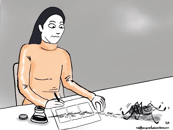
Meet Gerald the Goat
Goat and friends will be popping up to help illustrate some of the ideas in this article. I’ve been drawing the Gerald the Goat strip for about three years now and doing so has certainly helped me to work on my own lettering. They’ll also be some other characters and cartoons to help show key points.
Remember that cartooning is all about exaggerating things, often something common that appears in every day life and then putting a twist on it.
Rewrite:
Suitable lettering can add much to the effectiveness of a cartoon. It can emphasize the spirit of the cartoon and give tone to the drawing. So likewise, it is possible to ruin a fine comic strip with poor lettering. For lettering, a steady hand is necessary. Copy alphabets over and over until the technique is mastered.
There is no standard style of lettering for cartoons.
Flex your writing muscle
Writing is a skill that can be developed like any other, I’m certainly still developing mine.
The more you practice your writing, the better it will get.
Don’t settle for the first draft that you come up with.
It’s also a good idea to return to your writing later on after having taken a break and re-read it to see if it still makes sense and flows well.
Put yourself in your reader’s shoes
Imagine that you are the reader, encountering your strip for the first time. Does the writing make sense to you? Does it flow well?
Here’s a check list you could try:
How is the grammar?
How is the spelling?
Does the writing flow well?
Are there any words you could remove?
Will your reader be able to understand everything?
Try writing different versions - don’t settle for the first draft
[IMAGE: speech balloons....image of actual balloons maybe modifying Gerlad pic and maybe having wow! On it]
Lettering/speech bubbles
Words and pictures work together
In any sort of cartoon, words and pictures work together to get the idea or gag across, and shouldn’t be considered separately. So it’s a good idea to put as much care into the dialogue as the drawing of the characters.
Before you start drawing your first cartoon, have the script drafted out and some rough sketches for each frame.
Do your lettering first, and then draw the speech or thought balloon around it.
Handwrite or use set lettering?
It doesn’t matter whether you handwrite your own lettering or use the lettering in an app such Procreate or Sketches.
For the Gerald the Goat strip, I still use a font called ‘Chelsea’ from Sketches (check name)
I draw the strip in Procreate and then do the lettering in Sketches and import it as a transparent layer into Procreate.
Be careful not to cram too much writing into one bubble.
Different fonts can really change the tone of the cartoon.
The more text you have, the less space available for the art - and vice versa.
Experiment with using different fonts, font sizes, placing the text is different places within the frame.
Try many different ones until you come up with a style that suits you.
Use guidelines
The beauty of working in layers is that it is easy to draw some guidelines to help keep your writing straight. You’ll notice that the lines are perfectly aligned, however, the writing is a lot straighter than it would have been if done entirely freehand.
I find that that the more I draw freehand, the easier it becomes to keep it straight.
Balloons
Aaaa
Let your lettering breathe
Make sure to leave some space between your lettering and the surrounding speech/thought bubble so that it is easy to read.
Don’t write too many words in the bubble, as it can become too crowded and difficult to read.
Draft your speech bubbles, the same way you’d draft a drawing. Look over your writing and see if there are any unnecessary words you could remove. Don’t always settle for the first version.
[DRAW IMAGE TO ILLUSTRATE UNNECESSARY WORDS]
Don’t draw the bubble too close to your character’s mouth.
To rewrite:
‘A’ begins the conversation as his speech is at the top of the frame. At the end of the sentence, the eye naturally flows to the second bubble belonging to the other character. The first speaker’s second bubble is joined to the first by a path dispelling the need for two pointers heading for one head.
Making speech more dramatic/dramatic effects
Expression through bubbles
No touching!
Avoid having the balloons touch each other, they cause visual dissonance (can I rewrite this?)
A brief interlude…
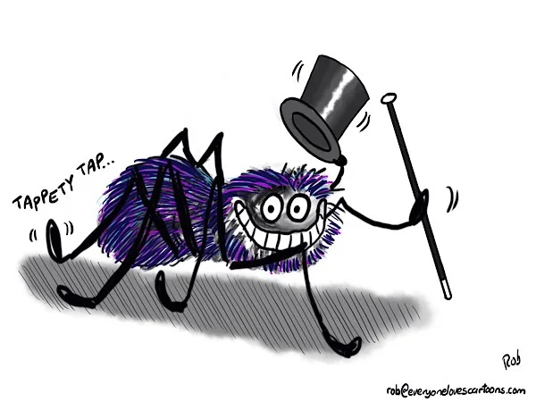
…with a tap-dancing spider…
Whispering
You can show the character whispering by drawing the balloon with a dashed stroke.
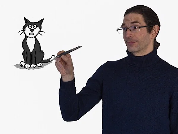
About Rob
Rob has been drawing cartoons for more years that he can remember. As well as drawing, he runs some online course to help folks draw their own cartoons.
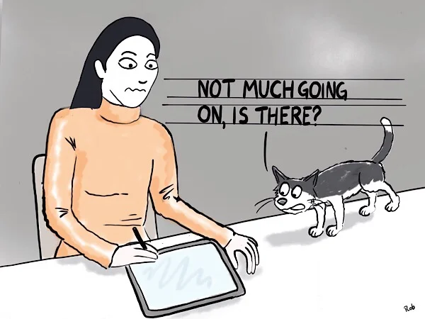
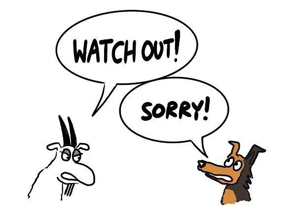
How we read dialogue
We read dialogue from left to right or top to bottom.
Thought balloons
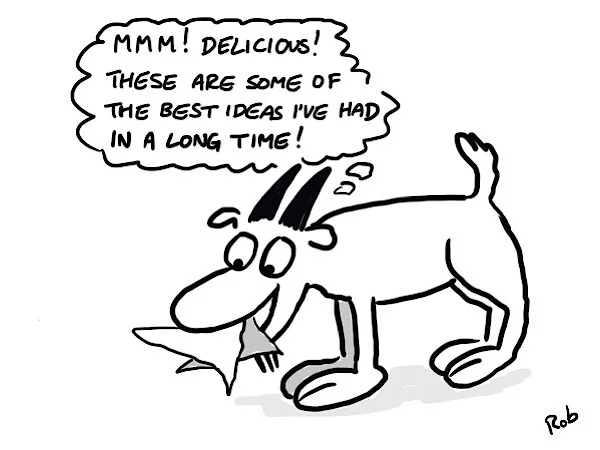
Thought balloons. These usually have three bubbles of diminishing size that reach towards the character’s head.
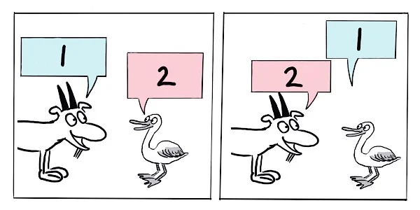
Joining balloons with connectors
You can use this when the conversation goes back and forth between two characters.
You can also use it when a character says two separate ideas after each other.
[image to show this?]
Summary
Flex your writing muscle
Put yourself in your reader’s shoes
How we read dialogue
Handwrite or set lettering?
Use guidelines
Balloons
Let your lettering breathe
Making speech more dramatic
About Rob
Rob has been drawing cartoons for more years that he can remember. As well as drawing, he runs some online course to help folks draw their own cartoons.